When you are in the process of selling your house and also looking to practice your machine learning skills, it has to occur to you at some point to put the two together. Today, I used a housing price dataset to create two regression models to see which one is better at predicting the sales prices. I created a notebook you can view with all the code in my GitHub, but here I will just show a little of my code and a lot of my outputs!
Import packages for EDA
Let’s import the most immediately needed packages. Of course we need pandas, numpy, matplotlib, and scipy to do basic EDA. Also, included seaborn to make slightly more sophisticated looking visualizations.

The Dataset

This dataset on housing data from King County, Washington (2015-2015) is freely available online and I got it from this Towards Data Science article. The article states the data is typically for trying out regression models. Another time I may scrape Zillow, but the point of this exercise was training regression models and not cleaning raw data.
This dataset contains the following columns:
- ID (index)
- date
- price
- bedrooms
- bathrooms
- sqft_living
- sqft_lot
- floors
- waterfront (y/n)
- view
- condition (1-5)
- grade
- sqft_above
- sqft_basement
- yr_built (1900 – 2015)
- yr_renovated (0 if never)
- zipcode
- lat
- long
- sqft_living15
- sqft_lot15
Null values
A quick check for nulls revealed the data is completely filled in and ready for data exploration. Duplicates were also checked for and none were found.

Summary Statistics
I began with some basic summary statistics to get a feel for the data. With 21,613 rows and 21 columns, this is a nicely sized dataset for practice and will help the models run quickly.
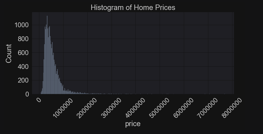
I started with my target variable, which is the house sale price. Average price was ~$540,000, while the median was further down at $450,000. This already tells me there are some outliers at the top-end pulling the mean upwards. The minimum price for a house sold was just $75,000 and the most expensive house sold for $7.7 million.

The maximum number of bedrooms in a house was thirty-three! And at least one home had no bedrooms!


Here are just some fun visuals. There is a lot more EDA in the actual notebook, but I limited the amount I am sharing here. Above, I was curious about whether the age of the house made it more or less expensive. Turns out, it’s both. Houses that were built before 1930 sold for much more than post_WW2/mid-century houses. Then houses built after 1970 become more expensive and the price climbs for recently built houses. Note this isn’t a time series, but a way to plot the house prices by decade.
Below, I wanted to see the frequency distribution of houses over year built. The oldest houses are scarcer and that may indicate why they are pricier than mid-century houses. It could, of course, also be a style choice. And there appears to be a great deal of new houses selling as well.

Distributions
It is critical to check out how the target variable (price) distributes and we can see it has a major right skew towards houses that sold for millions. The box plot below determined that houses sold for over ~$1.2 million were considered outliers. We will leave those in, because while they throw off the assumption of a normal distribution they are part of the real data and not mistakes. We have to take them into account.

Correlations/Feature Selection
Another major step is checking out correlations between the variables. Below is a scatter plot showing the relationship between house price and square footage designated as living space (aka closet space not included). There appears to be something of a linear trend, but most of the data piles near the bottom due to the large price range.

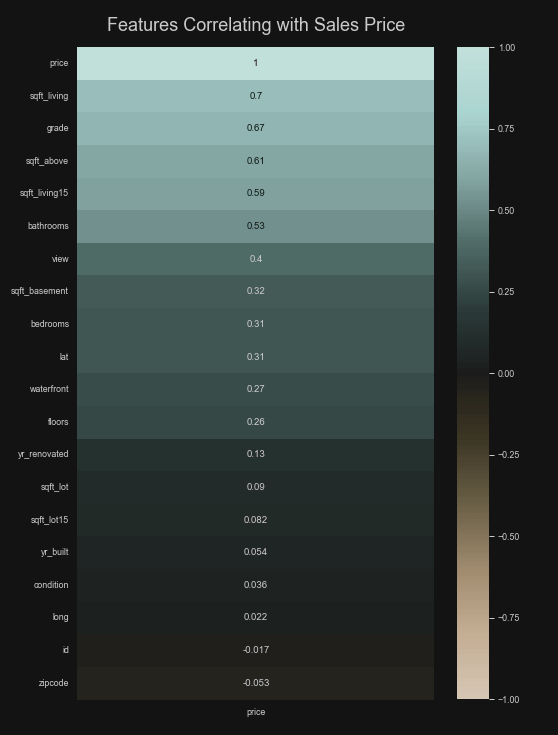
I did create a correlation matrix that plotted each variable against all others, but that wasn’t very helpful. It’s really to seek out multicollinearity. Square footing for living and square footage from above were the only two that had an overly strong correlation. What I really wanted to know was the relationship between house price and all the predictors and, specifically, how linear those relationships were. Here is a correlation matrix where price is given a Pearson r coefficient with each variable. It’s pretty obvious we can throw away some of these variables. For instance, latitude, longitude, and id don’t mean anything.
Here I created a pair grid to illustrate whether the relationship between price and the predictors were linear in nature. We have some linearity for bathrooms, square footage, grade, and bedrooms. I would say there is quite a lot of variance just by looking at these. And, of course, we have some ordinal/categorical variables such as whether the property has a waterfront or what condition it was rated. We will remove a few of these variables for multicollinearity or lack of usefulness. In the end, I turned sqft_basement into a binary variable (has or does not have one) and the same for yr_renovated by creating a column that noted whether it was ever renovated at all. Finally, I one-hot encoded the zip codes, which added seventy columns to the dataset.


Splitting the Data
Here I just split up the data into training and testing sets with an 80/20 split.

The Multiple Regression Model

I imported the linear regression model and made sure to normalize the data and fit it to the training data.
R-Square for Training Data
I used Python to calculate an R-square value for the training data and it came to 0.807. This means that about 80.7% of the data’s variability can be accounted for by the model.
Cross Validation of Training Data
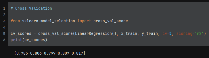
Next, I implemented cross validation into the model. This further splits up the training data and makes sure the model isn’t being trained consistently over the dataset. A mean cross validation score from these 5-folds came to 0.803 and the values seem to be pretty consistent throughout.
Predictions on the Test Set
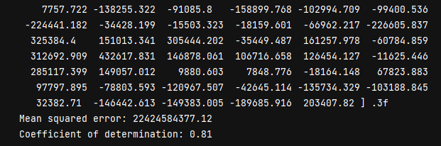
I had the model coefficients, MSE, and coefficient of determination printed out. We have a rather large MSE. I think the more important metric here is the R-square value for the test data. It was 0.81, which was basically even with the training results. This is a fairly decent model.
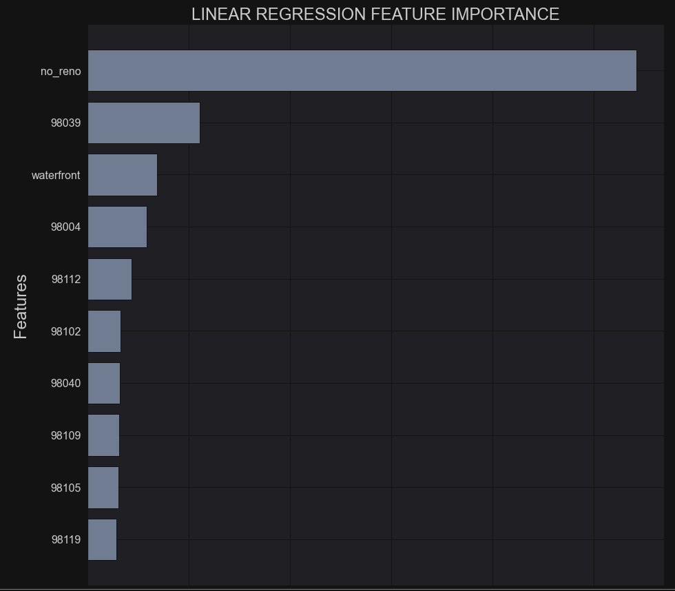
Importance of Each Predictor Variable
The importance of each predictor is plotted below and shows that the biggest predictor of price was whether the property had ever undergone a renovation. Next, was a zip code, which suggests that area is very desirable. And then waterfront was another major factor. Now, less than 1% of all the observations in the dataset had waterfront property. The rest of the top features were more zip codes. According to this model, it’s the neighborhood and not the house itself that sets the prices. Turns out, my assumption about the when a house was built doesn’t have much influence!
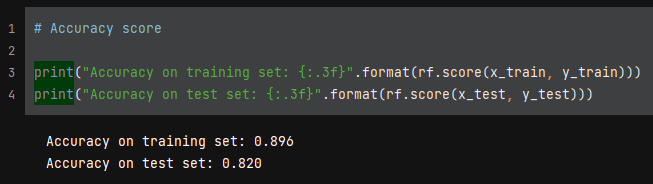
Random Forest Regressor
The linear model wasn’t bad, but I wanted to try out a non-parametric model to see if it would perform better. I think part of the issue was that the data was heavily skewed and a good chunk of the relationships with price were not linear in nature. I decided to engage a random forest regression model to compare results. It’s also robust to outliers.
I imported the model and set the hyperparameters to 150 trees, minimum 10 leaves, and minimum split of 20.
I again used cross validation to be sure of consistency with the training. Fold results range from 0.78 to 0.82 with an average of 0.797.


The training data came out to an R-square estimate of 0.837, which means about 84% of the variability is accounted for. The test data came in at 78.1%. This is slightly less accurate than the linear model, but I don’t think overfitting is an issue.

I decided to go back and change the hyperparameters a little. I reduced the number of trees to 100, made the minimum leaf sample 5, and put the split at minimum of 10. I saw improvement immediately.
Importance of Each Predictor Variable
I discovered some helpful code to plot the feature importance according to the random forest model. According to this graph, square footage, grade, year built, and waterfront were the most important features and that makes a lot of sense. And clearly some zip codes matter more than others, but this contrasts greatly with what the linear model used to make predictions. It asserted that zip codes were more important, but here house features are taken into account much more.

Actual By Predicted Values


Overall, the random forest performed slightly better than linear regression. I did manage to improve the model with a little intuition. You can see by the two scatter plots above that the random forest actual plotted by predicted is a slightly better fit, as in the line bisects the data points more evenly and is more centered. A grid search may help tune the hyperparameters to be a little more accurate. I think this exercise really shows that it all comes down to the assumptions of your chosen model and what your EDA reveals about whether your data fits said model.
