
In 2022, I was working on my master’s project at UNH and decided to test the conclusions of a recently published paper. As part of my work, I conducted a sentiment analysis of tweets related to COVID-19. My goal was to see if online sentiment could link county-level partisanship with COVID case and death rates. I won’t get into all the specifics of the main hypothesis of my project, but I will share my methods and results for conducting my Twitter analysis.
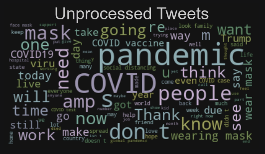
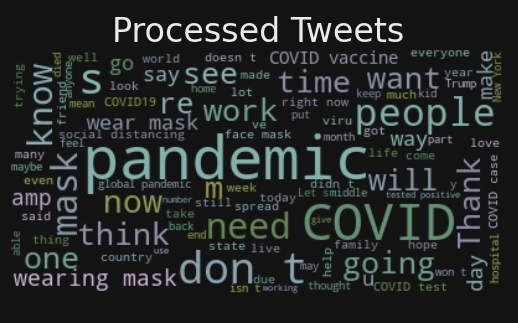
Using the Tweepy library, I extracted about 2.7 million tweets from Twitter’s API. Unfortunately, they had already removed their COVID-specific API, which would have made my query much easier. But I managed to extract tweets with relevant keywords and hashtags. Before sentiment analysis could begin, the tweets had to be preprocessed by removing stop-words (such as ‘and’, ‘the’, and ‘a’), lemmatizing, correcting spelling, and removing punctuation. Here are two wordclouds showing the most frequently used words before and after preprocessing.
Preprocessing
I was interested in COVID-related tweets that were focused on specific topics. Namely, how were people discussing the politics surrounding COVID and how people felt about the safety mandates in place such as masking and distancing. In order to drill down to these specific tweets, I needed to do some topic modelling. The most obvious choices were LDA and GSDMM as they are both very popular topic classification models.
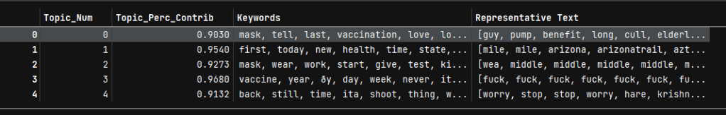
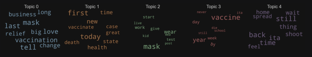
LDA or Latent Dirichlet Allocation is one of the most popular tools for this type of project, but it only assumes one topic per document. It was stated in a lot of articles I read that this might be a problem for micro-blogging platforms like Twitter. But I decided to try it anyway. The five topics shown below reveal that this caveat was spot on. The terms selected by the LDA model are rather ambiguous in both their grouping and their meaning. For example, in Topic 0, what do the words ‘business’, ‘big’, ‘vaccination’, ‘love’, and ‘tell’ work together to summarize a topic? In short, they don’t.
Topic Modelling: LDA
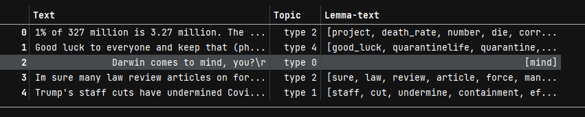
I had much better luck with GSDMM or Gibbs Sampling Dirichlet Multinomial Mixture, which I will just refer to as Gibbs here. It worked much better. Below in the sample of the data, you can see the original text, the topic number it was assigned to, and the reduced version of the tweet that kept all relevant terms. Looking at the wordclouds below that, the most frequent terms paint a much stronger picture that the LDA. Topic 1 mentions ‘Trump’, ‘state’, ‘country’, ‘economy’, ‘election’, ‘plan’, ‘crisis’, ‘vote’, ‘response’, ‘death’, ‘vaccine’, and ‘job’. All these terms together suggest that all tweets where people discuss the US government’s response to the pandemic was successfully done.
Topic Modelling: GSDMM

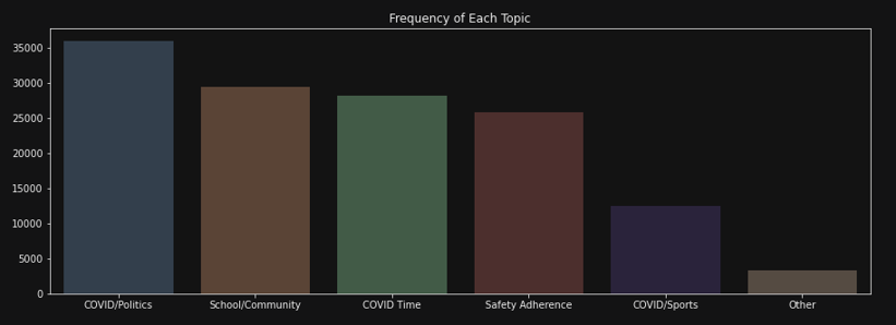
The tweets were very nicely separated into five groups, but they needed names to give context. Using the wordclouds I generated, I termed the topics as you can see below as ‘COVID/Politics’, ‘School/Community’, ‘COVID Time’ (short for: COVID over time), ‘Safety Adherence’, ‘COVID/Sports’, and ‘Other’. I was very happy to see that there were very few tweets the model could not really classify.
Valence Scoring with VADER
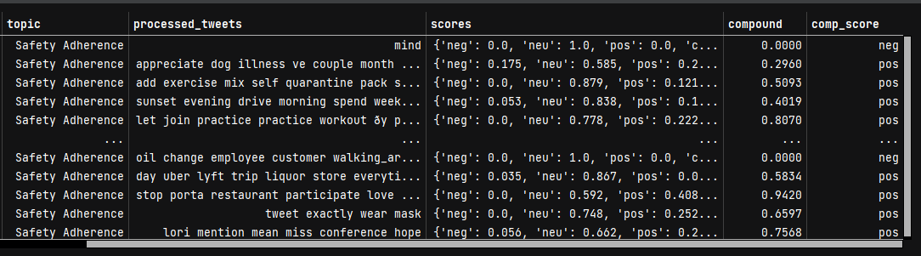
Usually sentiment analysis works to classify a document as positive, negative, or neutral. But VADER (Valence Aware Dictionary for Sentiment Reasoning) is also able to give a valence score for each term in the text and tell you how positive, negative, or neutral a document is after normalizing all scores in the text with a ‘compound score.’ In the sample of the data just below you can see the topic column followed by the cleaned version of the tweet. Then each term is scored by itself and then a compound score is assigned and I added a categorical version of that compound score to assign the result as either ‘pos’, ‘neg’, or ‘neu.’
Here is a breakdown of how all the tweets were classified by the Vader algorithm.

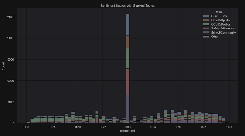
But, perhaps to put it in a better perspective, here is a stacked histogram of the distribution of all the tweets along the sentiment spectrum. It is interesting (and extremely obvious) to note that most of the tweets achieved a neutral score. Another interesting note how neutrality sinks as soon as you go either right or left (negative or positive) and then more tweets are scored as moderately negative or positive. Then it tapers down again on both sides, which seems to indicate that most tweets are not extreme in either case to warrant a score of totally negative or totally positive.
In Conclusion
It’s always good to question the nature of our conclusions. Given how much neutrality there is in the last graph, I had some thoughts. We might wonder if the preprocessing step removed some needed context for the model to run or we could instead infer that many people posted factual things about COVID such as whether a school was doing distance learning in their town or where there were home test kits available. Some people did post tweets of that nature with the intention of spreading facts and awareness. Also, very few tweets were classified as extremely negative or positive. Given the nature of the pandemic’s affect on our lives, I have to wonder if that is true for the negativity aspect. I have seen some tweets with extremely negative sentiments. However, it is also important to remember that this is just a sample of the available number of tweets and drawing a new sample could show different results. Really, this should be resampled a number of times to check for variability. But my laptop drew the line at 2.7 million tweets. Ultimately, I did not end up using this analysis in the main body of my project. It was a fun and totally worthwhile experience, however, and I did present these findings as a fun detour in my presentation to the department.
